Design: verb (used with object) – to plan and fashion artistically or skilfully.
Why we emphasise on the word designing rather than writing is because only a well-crafted resume will open up the gates to your potential employer. Almost 50% candidates are rejected for a job they deserve at the resume processing stage itself, because the resume is unable to highlight the true potential of the candidate. Of the 50% who go through to the interviews, 20% are those who the employer has almost selected in their minds based on the excellence reflected in the resume. The rest 80% (of the 50%) are grinded.
So when I talk about designing a resume, I mean planning carefully and crafting it so that every single piece of information is put where it should be and where an employer will come looking for. If you do that perfectly even in the worst of formats, your first round of interview will almost always be cleared.
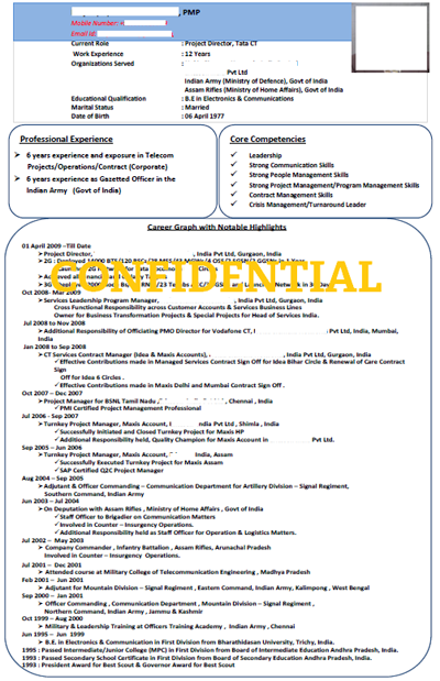
 As an example, look at the resume on the right. This is the resume of a COO level Project Director at one of the biggest Multi National Corporations in the world (Fortune 100).
Now professionally, this is one of the worst resumes I have ever seen at first glance. The boxes, the colour scheme, the entire representation is faulty. In fact it is neither a standard format nor pleasing to the eye. The trouble was that this resume was sent to me by one of our clients who wanted me to present information in his own resume like presented on the right! That is when I noticed how perfect this Project Director’s resume actually is.
If you look aside of the poor format and ugly looking boxes, you will notice that this application is able to catch any employer’s eye in the first 25% of the page itself. Another 4-6 lines of the professional experience, and almost any employer (from his industry) will call him up for an interview! Guaranteed.
Reason: The first 9 lines of this resume captures everything you need to know about your new hire – his present role, experience, organizations served, education and date of birth. The next 6 lines talk about his strengths and then the rest is his professional experience; 4-6 lines into it and you have every detail about the kind of Project Director this guy is!
Now this is in no way how a resume should be formatted. In fact this is not a standard format and may not be considered by HR managers who are particular about representation. There are other faults as well like mentioning of subjective strengths, a lot of irrelevant information which could have been presented on demand and a timeline of events without categorization. But still the resume stands out. The reason is the way it has been designed, keeping any employer’s perspective in mind.
Of course, the excellent experience makes a huge impact on the resume and infact overshadows the poor format, but then that is the point. Even for a Project Director, if the first page is spent talking about Skill Sets and defining those skill sets (as many resume writing services do), then by the end of it any employer would generally lose interest and may even prefer someone else over the profile.
As for my client who shared this resume, I did use a different set of rules and representation to give him a product which I could call superior than the resume above, but then this resume is where the entire inspiration and learning came from. As they say, even the bad things end up teaching you something good! Comments welcome.


